
Angular Mobile Modals / Angular Mobile Popup
Angular Mobile Modals - Bootstrap 4 & Material Design
Angular Bootstrap modal is a dialog box/popup window which can be used for lightboxes, user notifications, UI enhancements, e-commerce components and many other cases.
Create modal
You can create modals dynamically from any component using built-in service. To achieve this, follow these steps:
1. Create new component with Angular CLI and add HTML code to the template.
ng generate component modal
<StackLayout class="mdb-modal-body">
  <Image
    src="https://mdbootstrap.com/img/Marketing/other/logo/logo-mdb-angular-small.png"
    stretch="none"
    horizontalAlignment="center"
    margin="10 0"
  ></Image>
  <Label
    text="Lorem ipsum dolor sit amet, consectetur adipiscing elit, sed do eiusmod tempor incididunt ut labore et dolore magna aliqua."
    textWrap="true"
    class="mdb-modal-content"
    style="text-align: center"
  ></Label>

  <Button mdbBtn theme="primary" text="Close" (tap)="close()"></Button>
</StackLayout>
</div>
import { Component, OnInit } from '@angular/core';
import { ModalDialogParams } from 'nativescript-angular';

@Component({
selector: 'app-modal',
templateUrl: './modal.component.html',
})
export class ModalComponent {

  constructor(private params: ModalDialogParams) {}

  close() {
    this.params.closeCallback();
  }

}
2. Add the modal component to entryComponents in your app.module file
import { MdbAngularNativeModule } from 'mdb-angular-mobile';

import { ModalComponent } from 'your-path-to-modal-component';

import { NgModule } from '@angular/core';

...

imports: [
...
MdbAngularNativeModule,
...
],
entryComponents: [ ModalComponent ]
3. Inject ModalDialogService to the component from which you want to open the modal and use showModal method.
<StackLayout>
  <Button text="Open Modal" (tap)="openModal()" class="btn btn-primary"></Button>
</StackLayout>
import { Component, OnInit, ViewContainerRef } from '@angular/core';
import { ModalDialogService, ModalDialogOptions } from 'nativescript-angular';
import { ModalComponent } from '../modal/modal.component';

@Component({
  selector: 'Home',
  moduleId: module.id,
  templateUrl: './home.component.html',
})
export class HomeComponent implements OnInit {
  constructor(private modalService: ModalDialogService, private vcr: ViewContainerRef) {
  }

  ngOnInit(): void {}

  openModal() {
    const options: ModalDialogOptions = {
      viewContainerRef: this.vcr,
    };
    this.modalService.showModal(ModalComponent, options);
  }
}
Customize modal
You can customize the dynamic modal by changing its options and passing them to showModal method of ModalDialogService.
<StackLayout>
  <Button text="Open Modal" (tap)="openModal()" class="btn btn-primary"></Button>
</StackLayout>
import { Component, OnInit, ViewContainerRef } from '@angular/core';
import { ModalDialogService, ModalDialogOptions } from 'nativescript-angular';
import { ModalComponent } from '../modal/modal.component';

@Component({
  selector: 'Home',
  moduleId: module.id,
  templateUrl: './home.component.html',
})
export class HomeComponent implements OnInit {
  constructor(private modalService: ModalDialogService, private vcr: ViewContainerRef) {
  }

  ngOnInit(): void {}

  openModal() {
    const options: ModalDialogOptions = {
      viewContainerRef: this.vcr,
      fullscreen: false,
      animated: true,
      stretched: false,
    };
    this.modalService.showModal(ModalComponent, options);
  }
}
Inject data to the modal
You can inject data to the dynamic modal by passing it to the context parameter in the modal options.
<button mdbBtn color="primary" (click)="openModal()">Open modal</button>
import { Component, OnInit, ViewContainerRef } from '@angular/core';
import { ModalDialogService, ModalDialogOptions } from 'nativescript-angular';
import { ModalComponent } from '../modal/modal.component';

@Component({
  selector: 'Home',
  moduleId: module.id,
  templateUrl: './home.component.html',
})
export class HomeComponent implements OnInit {
  constructor(private modalService: ModalDialogService, private vcr: ViewContainerRef) {
  }

  ngOnInit(): void {}

  openModal() {
    const options: ModalDialogOptions = {
      viewContainerRef: this.vcr,
      context: {
          title: 'Custom modal title'
      }
    };
    this.modalService.showModal(ModalComponent, options);
  }
}
Here is an example showing how to use injected data in the modal component:
<StackLayout class="mdb-modal-body">
  <Image
    src="https://mdbootstrap.com/img/Marketing/other/logo/logo-mdb-angular-small.png"
    stretch="none"
    horizontalAlignment="center"
    margin="10 0"
  ></Image>
  <Label
    [text]="title"
    textWrap="true"
    class="mdb-modal-content"
    style="text-align: center"
  ></Label>

  <Button mdbBtn theme="primary" text="Close" (tap)="close()"></Button>
</StackLayout>
import { Component, OnInit } from '@angular/core';
import { MDBModalRef } from 'ng-uikit-pro-standard';

@Component({
selector: 'app-modal',
templateUrl: './modal.component.html',
})
export class ModalComponent implements OnInit {
  title: string;

  constructor(private params: ModalDialogParams) {}

  ngOnInit() {
      this.title = this.params.context.title;
  }

  close() {
    this.params.closeCallback();
  }

}
Receive data from the modal
You can receive data from the modal to use it in other component:
<StackLayout class="mdb-modal-notify mdb-modal-danger">
  <StackLayout orientation="vertical" class="mdb-modal-header">
    <Label text="Are you sure?"></Label>
  </StackLayout>
  <StackLayout horizontalAlign="center" width="100%" class="mdb-modal-body">
    <MDBIcon class="fas text-info" name="times" style="text-align: center"></MDBIcon>
  </StackLayout>
  <StackLayout orientation="horizontal" horizontalAlignment="center">
    <Button mdbBtn theme="danger" text="Yes" outline="true" (tap)="close('Yes')"></Button>
    <Button mdbBtn theme="danger" text="No" (tap)="close('No')"></Button>
  </StackLayout>
</StackLayout>
import { Component } from '@angular/core';
import { MDBModalRef } from 'ng-uikit-pro-standard';
import { Subject } from 'rxjs';

@Component({
selector: 'app-modal',
templateUrl: './modal.component.html',
})
export class ModalComponent {
  constructor(private params: ModalDialogParams) {}


  close(result: string) {
    this.params.closeCallback(result);
  }

}
Here is an example showing how to use data received from modal in other component
<button mdbBtn color="primary" (click)="openModal()">Open modal</button>
import { Component, OnInit, ViewContainerRef } from '@angular/core';
import { ModalDialogService, ModalDialogOptions } from 'nativescript-angular';
import { ModalComponent } from '../modal/modal.component';

@Component({
  selector: 'Home',
  moduleId: module.id,
  templateUrl: './home.component.html',
})
export class HomeComponent implements OnInit {
  constructor(private modalService: ModalDialogService, private vcr: ViewContainerRef) {
  }

  ngOnInit(): void {}

  openModal() {
    const options: ModalDialogOptions = {
      viewContainerRef: this.vcr,
    };
    const modalRef = this.modalService.showModal(ModalComponent, options);

    modalRef.then(result => {
        console.log(result);
    })
  }
Listen to events
You can listen to events of dynamic modal:
        <div class="modal-content">
            <div class="modal-header">
                <button type="button" class="close pull-right" aria-label="Close" (click)="modalRef.hide()">
                <span aria-hidden="true">×</span>
                </button>
                <h4 class="modal-title w-100" id="myModalLabel">Modal title</h4>
            </div>
            <div class="modal-body">
                ...
            </div>
            <div class="modal-footer">
                <button type="button" mdbBtn color="secondary" class="waves-light" aria-label="Close" (click)="modalRef.hide()" mdbWavesEffect>Close</button>
                <button type="button" mdbBtn color="primary" class="relative waves-light" mdbWavesEffect>Save!</button>
            </div>
        </div>
import { Component } from '@angular/core';
import { MDBModalRef } from 'ng-uikit-pro-standard';

@Component({
selector: 'app-modal',
templateUrl: './modal.component.html',
})
export class ModalComponent {

constructor(public modalRef: MDBModalRef) {}

}
Basic example
Follow the steps in create modal section, then copy following code to your modal html file to change the modal template:
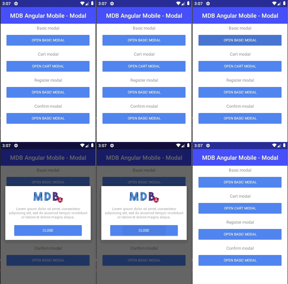
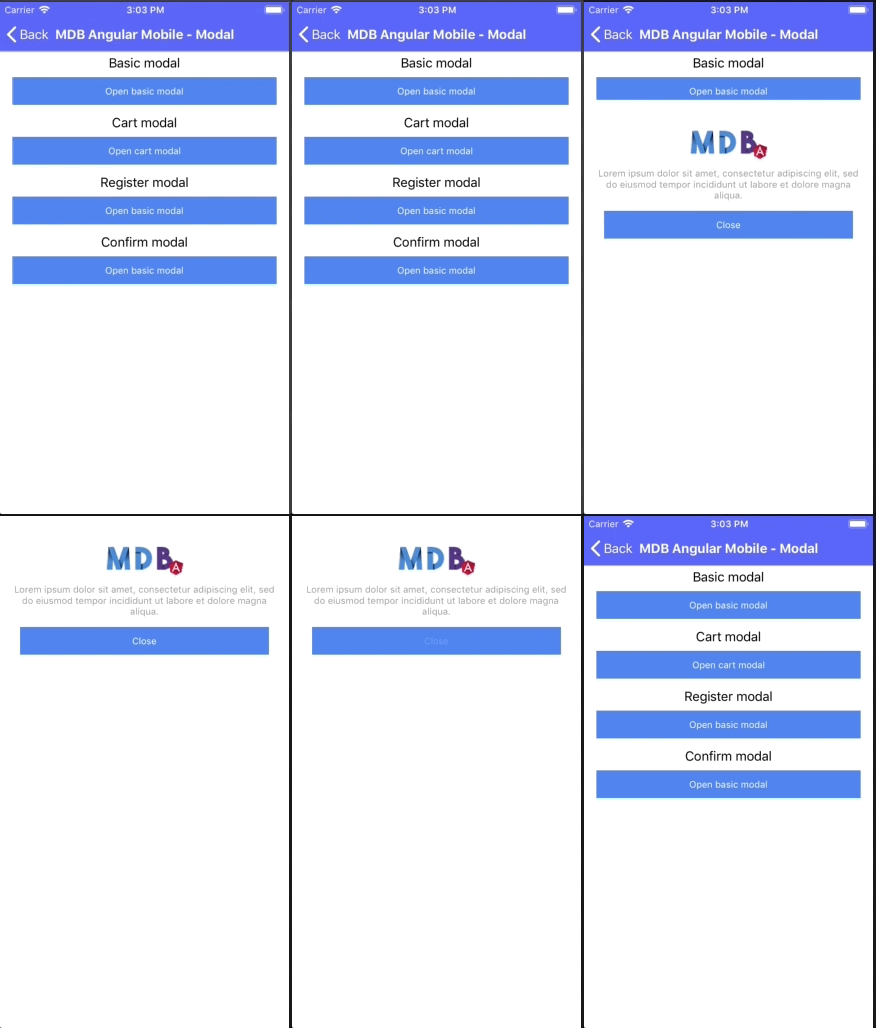
<StackLayout class="mdb-modal-body">
  <Image
    src="https://mdbootstrap.com/img/Marketing/other/logo/logo-mdb-angular-small.png"
    stretch="none"
    horizontalAlignment="center"
    margin="10 0"
  ></Image>
  <Label
    text="Lorem ipsum dolor sit amet, consectetur adipiscing elit, sed do eiusmod tempor incididunt ut labore et dolore magna aliqua."
    textWrap="true"
    class="mdb-modal-content"
    style="text-align: center"
  ></Label>

  <Button mdbBtn theme="primary" text="Close" (tap)="close()"></Button>
</StackLayout>
Cart modal
Follow the steps in create modal section, then copy following code to your modal html file to change the modal template:
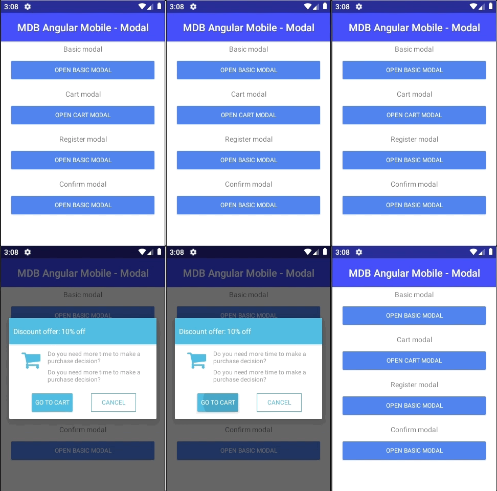
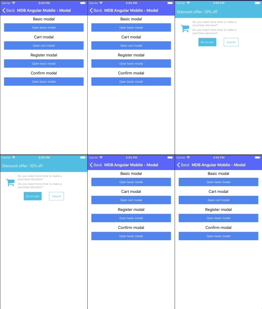
<StackLayout class="mdb-modal-notify mdb-modal-info">
  <StackLayout orientation="vertical" class="mdb-modal-header">
    <Label text="Discount offer: 10% off">Product in the cart</Label>
  </StackLayout>
  <StackLayout orientation="horizontal" class="mdb-modal-body">
    <MDBIcon class="fas text-info" name="shopping-cart"></MDBIcon>
    <StackLayout>
      <Label
        textWrap="true"
        text="Do you need more time to make a purchase decision?"
        class="mdb-modal-content"
      ></Label>
      <Label
        textWrap="true"
        text="Do you need more time to make a purchase decision?"
        class="mdb-modal-content"
      ></Label>
    </StackLayout>
  </StackLayout>
  <StackLayout orientation="horizontal" horizontalAlignment="center">
    <Button mdbBtn theme="info" text="Go to cart" (tap)="close()"></Button>
    <Button mdbBtn theme="info" text="Cancel" outline="true" (tap)="close()"></Button>
  </StackLayout>
</StackLayout>
Confirm modal
Follow the steps in create modal section, then copy following code to your modal html file to change the modal template:
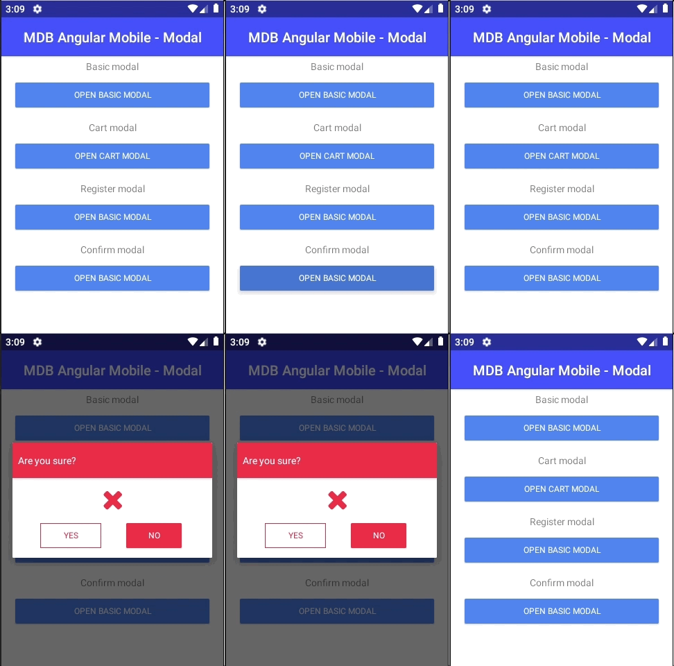
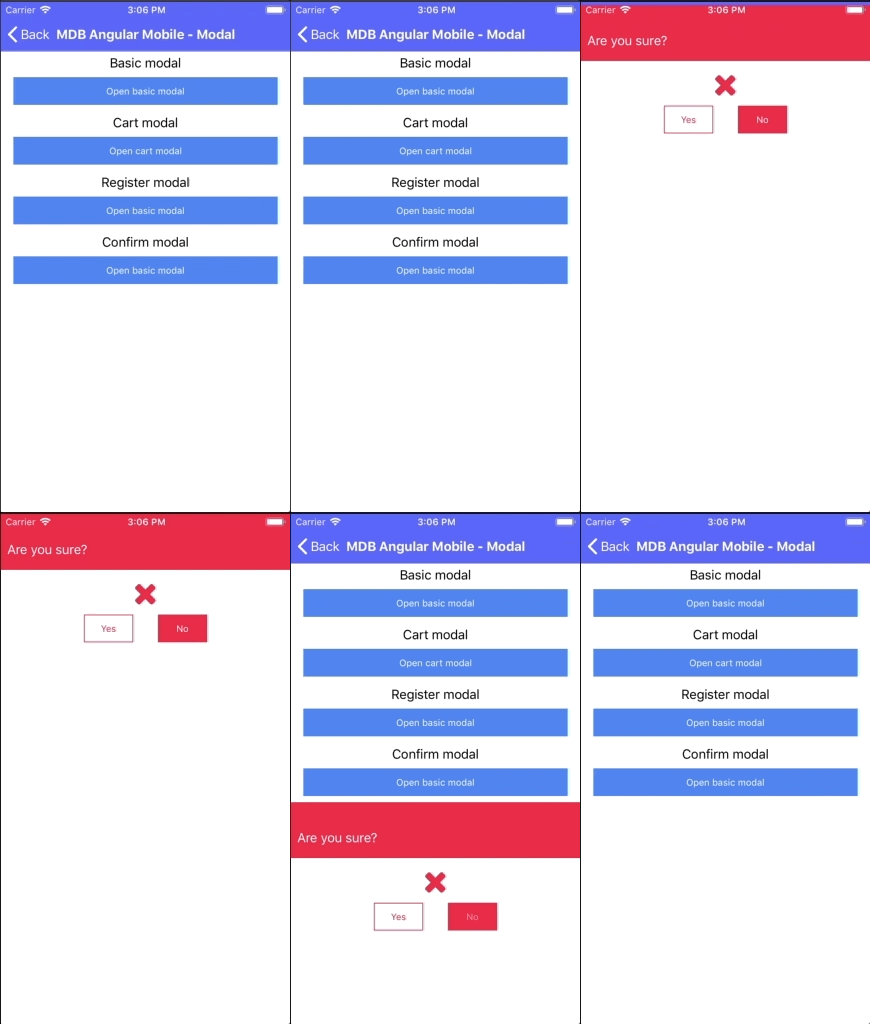
<StackLayout class="mdb-modal-notify mdb-modal-danger">
  <StackLayout orientation="vertical" class="mdb-modal-header">
    <Label text="Are you sure?"></Label>
  </StackLayout>
  <StackLayout horizontalAlign="center" width="100%" class="mdb-modal-body">
    <MDBIcon class="fas text-info" name="times" style="text-align: center"></MDBIcon>
  </StackLayout>
  <StackLayout orientation="horizontal" horizontalAlignment="center">
    <Button mdbBtn theme="danger" text="Yes" outline="true" (tap)="close()"></Button>
    <Button mdbBtn theme="danger" text="No" (tap)="close()"></Button>
  </StackLayout>
</StackLayout>
Sign In modal
Follow the steps in create modal section, then copy following code to your modal html file to change the modal template:
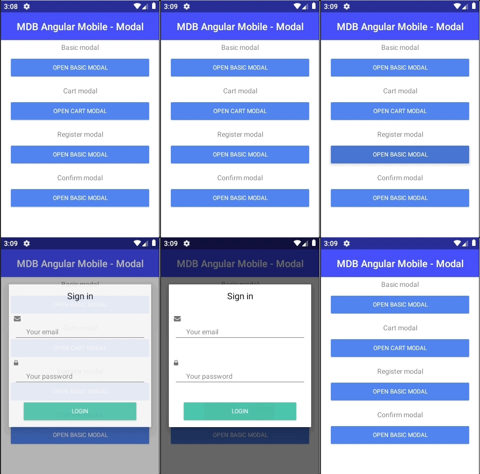
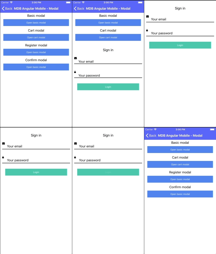
<StackLayout class="mdb-modal-body">
<Label text="Sign in" class="mdb-modal-title"></Label>
<StackLayout width="100%">
<MDBError [input]="field" text="error"></MDBError>
<Label mdbInputIcon text="" class="fas"></Label>
<TextField
validate="true"
#field="mdbValidate"
mdbValidate
mdbInput
label="Your email"
minlength="5"
></TextField>
</StackLayout>
<StackLayout width="100%">
<MDBError [input]="field" text="error"></MDBError>
<Label mdbInputIcon text="
" class="fas"></Label>
<TextField
validate="true"
#field="mdbValidate"
mdbValidate
mdbInput
label="Your password"
minlength="5"
></TextField>
</StackLayout>
<Button mdbBtn theme="default" text="Login" (tap)="close()"></Button>
</StackLayout>
Angular Mobile Modals - API
In this section you will find informations about required modules and available inputs, outputs, methods and events of modals component.
Modules used
In order to speed up your application, you can choose to import only the modules you actually need, instead of importing the entire MDB Angular library. Remember that importing the entire library, and immediately afterwards a specific module, is bad practice, and can cause application errors.
    // MDB Angular Pro
    import { NativeScriptModule } from 'nativescript-angular'
Options
| Name | Type | Default | Description | Example |
|---|---|---|---|---|
animated
|
boolean | true | Allow to turn on/off modal animation |
animated: false
|
context
|
any | - | Allow to pass data to displayed modal |
context: {title: 'Modal custom title'}
|
fullscreen
|
boolean | false | Specifying whether to show the modal in full-screen mode |
fullscreen: true
|
stretched
|
boolean | false | Specyfing whether to stretch the modal when not in full-screen mode |
stretched: true
|