
Angular Mobile Dropdown
Angular Mobile Dropdown - Bootstrap 4 & Material Design
Dropdowns may be used to create a menu for navigation, or field for select one from few options.
Basic example
Wrapping dropdown
Dropdown is constructed in such a way that its direct parent must always be
AbsoluteLayout. This layout should contain only the dropdown activator and the dropdown itself. Without this, the dropdown may not work properly.
Basic usage of dropdown - dropdown with his activator wrapped in AbsoluteLayout
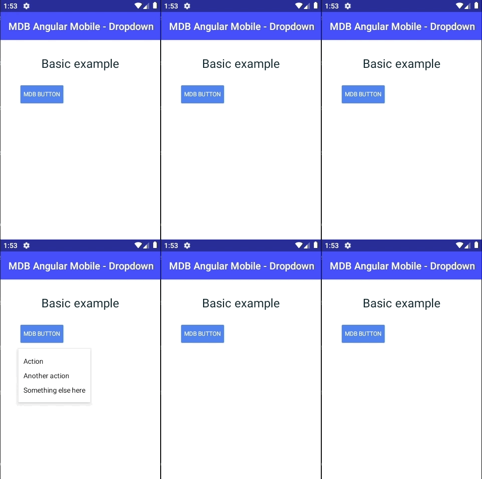
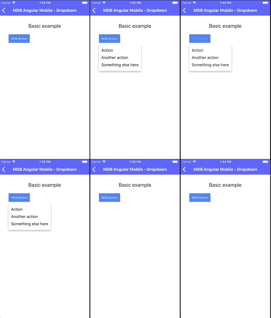
        <AbsoluteLayout>
          <Button mdbBtn theme="primary" mdbDropdown [dropdown]="menu" text="MDB Button"></Button>

          <MDBDropdownMenu
            #menu="mdbDropdownMenu">
            <Label
              text="Action"
              class="mdb-dropdown-item"
              MDBWavesEffect
            ></Label>
            <Label
              text="Another action"
              class="mdb-dropdown-item"
              MDBWavesEffect
            ></Label>
            <Label
              text="Something else here"
              class="mdb-dropdown-item"
              MDBWavesEffect
            ></Label>
          </MDBDropdownMenu>
        </AbsoluteLayout>
Dropdown with header
There's possibility to add a special dropdown header, which may describe user, what he should do.
        <AbsoluteLayout>
          <Button mdbBtn theme="primary" mdbDropdown [dropdown]="menu" text="MDB Button"></Button>

          <MDBDropdownMenu
            #menu="mdbDropdownMenu">
            <Label text="Dropdown header" class="mdb-dropdown-header"></Label>
            <Label
              text="Action"
              class="mdb-dropdown-item"
              MDBWavesEffect
            ></Label>
            <Label
              text="Another action"
              class="mdb-dropdown-item"
              MDBWavesEffect
            ></Label>
            <Label
              text="Something else here"
              class="mdb-dropdown-item"
              MDBWavesEffect
            ></Label>
          </MDBDropdownMenu>
        </AbsoluteLayout>
Dropdown placement
There's possibility to change placement of the dropdown in four ways - top, bottom, left, right
        <AbsoluteLayout>
          <Button mdbBtn theme="primary" mdbDropdown [dropdown]="menu" text="MDB Button"></Button>

          <MDBDropdownMenu placement="right"
                           #menu="mdbDropdownMenu">
            <Label
              text="Action"
              class="mdb-dropdown-item"
              MDBWavesEffect
            ></Label>
            <Label
              text="Another action"
              class="mdb-dropdown-item"
              MDBWavesEffect
            ></Label>
            <Label
              text="Something else here"
              class="mdb-dropdown-item"
              MDBWavesEffect
            ></Label>
          </MDBDropdownMenu>
        </AbsoluteLayout>
Using events
Dropdown has four events which can be used to determine actual dropdown state
        <AbsoluteLayout>
          <Button mdbBtn theme="primary" mdbDropdown [dropdown]="menu" text="MDB Button"></Button>

          <MDBDropdownMenu
            (dropdownShow)="onDropdownShow($event)"
            (dropdownShown)="onDropdownShown($event)"
            (dropdownHide)="onDropdownHide($event)"
            (dropdownHidden)="onDropdownHidden($event)"
            #menu="mdbDropdownMenu">
            <Label
              text="Action"
              class="mdb-dropdown-item"
              MDBWavesEffect
            ></Label>
            <Label
              text="Another action"
              class="mdb-dropdown-item"
              MDBWavesEffect
            ></Label>
            <Label
              text="Something else here"
              class="mdb-dropdown-item"
              MDBWavesEffect
            ></Label>
          </MDBDropdownMenu>
        </AbsoluteLayout>
        import {Component} from '@angular/core';

        @Component({
          selector: 'Home',
          moduleId: module.id,
          templateUrl: './home.component.html',
        })
        export class HomeComponent {
          onDropdownShow($event: any) {
            console.log(`show: ${$event}`);
          }

          onDropdownShown($event: any) {
            console.log(`shown: ${$event}`);
          }

          onDropdownHide($event: any) {
            console.log(`hide: ${$event}`);
          }

          onDropdownHidden($event: any) {
            console.log(`hidden: ${$event}`);
          }
        }
Angular Mobile Dropdown - API
In this section you will find informations about dropdown and its required modules and available inputs, outputs, methods and events.
Modules used
In order to speed up your application, you can choose to import only the modules you actually need, instead of importing the entire MDB Angular Mobile library. Remember that importing the entire library, and immediately afterwards a specific module, is bad practice, and can cause application errors.
    // MDB Angular Mobile Free
import { MdbDropdownModule } from 'mdb-angular-mobile'Components
MdbDropdownMenu
Selector: MDBDropdownMenu
Type: MdbDropdownMenuComponent
Directives
MdbDropdown
Selector: mdbDropdown
Type: MdbDropdownDirective
Inputs
MdbDropdownDirective
| Name | Type | Default | Description | Example |
|---|---|---|---|---|
dropdown
|
MdbDropdownMenuComponent | - | This input is necessary for proper working dropdown. Binds dropdown template to dropdown activator. | [dropdown]="menu" |
MdbDropdownMenuComponent
| Name | Type | Default | Description | Example |
|---|---|---|---|---|
duration
|
number | 300 | Allow to overwrite dropdown animation duration. Time in ms. | duration="1000" |
placement
|
'left' | 'right' | 'top' | 'bottom' | 'bottom' | Allow to set the place, where dropdown will be rendered. If dropdown won't fit in remaining space, it will render opposite of actual placement. | placement="right" |
Events
MdbDropdownMenuComponent
| Name | Type | Description | Example |
|---|---|---|---|
dropdownShown |
boolean | This event fires immediately when the dropdown is shown. | (dropdownShown)="dropdownShown($event)" |
dropdownShow |
boolean | This event fires immediately when the show method is called. | (dropdownShow)="dropdownShow($event)" |
dropdownHide |
boolean | This event fires immediately when hide method is called. | (dropdownHide)="dropdownHide($event)" |
dropdownHidden |
boolean | This event fires immediately when the dropdown is hidden. | (dropdownHidden)="dropdownHidden($event)" |