
Angular Mobile Panels
Angular Mobile Panels - Bootstrap 4 & Material Design
Panels are basically cards, but without any images. Use them if you want to build clear and elegant layout without images
Basic example
Each mdb-card component must have his own separate wrapper - StackLayout.
For more detailed documentation, please visit Cards documentation
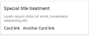
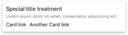
        <StackLayout>
          <mdb-card style="">
            <FlexboxLayout flexDirection="column" alignItems="flex-start">
              <StackLayout>
                <mdb-card-body>
                  <mdb-card-title text="Basic example"></mdb-card-title>
                  <mdb-card-text [text]="loremIpsumText"></mdb-card-text>

                  <FlexboxLayout>
                    <Label class="card-link" mdbWavesEffect text="Card link"></Label>
                    <Label class="card-link" text="Another Card link" style="margin-left: 10"
                           mdbWavesEffect></Label>
                  </FlexboxLayout>
                </mdb-card-body>
              </StackLayout>
            </FlexboxLayout>
          </mdb-card>
        </StackLayout>
        import {Component} from '@angular/core';

        @Component({
          selector: 'App',
          moduleId: module.id,
          templateUrl: './app.component.html',
        })
        export class AppComponent {
          loremIpsumText = `Some quick example text to build on the panel title and make up the bulk of the panel's content.`;
        }
Panel with footer
Use mdb-card-footer to add good-looking footer to the card element.
For more detailed documentation, please visit Cards documentation
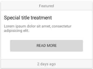
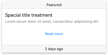
        <StackLayout>
          <mdb-card>
            <FlexboxLayout flexDirection="column" alignItems="flex-start">
              <StackLayout>
                <mdb-card-body>
                  <mdb-card-title text="Card with footer"></mdb-card-title>
                  <mdb-card-text [text]="loremIpsumText"></mdb-card-text>
                  <FlexboxLayout>
                    <Label class="card-link" mdbWavesEffect text="Card link"></Label>
                    <Label class="card-link" text="Another Card link" style="margin-left: 10"
                           mdbWavesEffect></Label>
                  </FlexboxLayout>
                </mdb-card-body>
              </StackLayout>
              <mdb-card-footer class="text-center">
                <Label text="2 days ago"></Label>
              </mdb-card-footer>
            </FlexboxLayout>
          </mdb-card>
        </StackLayout>
        import {Component} from '@angular/core';

        @Component({
          selector: 'App',
          moduleId: module.id,
          templateUrl: './app.component.html',
        })
        export class AppComponent {
          loremIpsumText = `Some quick example text to build on the panel title and make up the bulk of the panel's content.`;
        }
Light panel
Create light & dark app layouts using light and dark cards. For more detailed documentation, please visit Cards documentation
        <StackLayout>
          <mdb-card style="">
            <FlexboxLayout flexDirection="column" alignItems="flex-start">
              <StackLayout>
                <mdb-card-body>
                  <mdb-card-title text="Light version"></mdb-card-title>
                  <StackLayout class="hr-light" style="margin-bottom: 8;"></StackLayout>
                  <mdb-card-text [text]="loremIpsumText"></mdb-card-text>
                  <FlexboxLayout justifyContent="flex-end">
                    <Label class="card-link" text="Read more" mdbWavesEffect></Label>
                  </FlexboxLayout>
                </mdb-card-body>
              </StackLayout>
            </FlexboxLayout>
          </mdb-card>
        </StackLayout>
        import {Component} from '@angular/core';

        @Component({
          selector: 'App',
          moduleId: module.id,
          templateUrl: './app.component.html',
        })
        export class AppComponent {
          loremIpsumText = `Some quick example text to build on the panel title and make up the bulk of the panel's content.`;
        }
Dark panel
Use the dark input to switch card to dark mode (black background with white fonts).
For more detailed documentation, please visit Cards documentation
        <StackLayout>
          <mdb-card style="">
            <FlexboxLayout flexDirection="column" alignItems="flex-start">
              <StackLayout>
                <mdb-card-body dark="true">
                  <mdb-card-title text="Light version"></mdb-card-title>
                  <StackLayout class="hr-light" style="margin-bottom: 8;"></StackLayout>
                  <mdb-card-text [text]="loremIpsumText"></mdb-card-text>
                  <FlexboxLayout justifyContent="flex-end">
                    <Label class="card-link" text="Read more" mdbWavesEffect></Label>
                  </FlexboxLayout>
                </mdb-card-body>
              </StackLayout>
            </FlexboxLayout>
          </mdb-card>
        </StackLayout>
        import {Component} from '@angular/core';

        @Component({
          selector: 'App',
          moduleId: module.id,
          templateUrl: './app.component.html',
        })
        export class AppComponent {
         loremIpsumText = `Some quick example text to build on the panel title and make up the bulk of the panel's content.`;
        }
Angular Mobile Panels - API
In this section you will find informations about panels and its required modules and available inputs, outputs, methods and events.
Modules used
In order to speed up your application, you can choose to import only the modules you actually need, instead of importing the entire MDB Angular Mobile library. Remember that importing the entire library, and immediately afterwards a specific module, is bad practice, and can cause application errors.
    // MDB Angular Mobile Free
import { MdbCardModule } from 'mdb-angular-mobile'Components
MdbCard
Selector: MDBCard
Type: MdbCardComponent
MdbCardBody
Selector: MDBCardBody
Type: MdbCardBodyComponent
MdbCardFooter
Selector: MDBCardFooter
Type: MdbCardFooterComponent
MdbCardHeader
Selector: MDBCardHeader
Type: MdbCardHeaderComponent
MdbCardText
Selector: MDBCardText
Type: MdbCardTextComponent
MdbCardTitle
Selector: MDBCardTitle
Type: MdbCardTitleComponent
Inputs
MdbCardComponent
| Name | Type | Default | Description | Example |
|---|---|---|---|---|
shadowLevel
|
number | 2 | Allow to modify shadow (elevation) level. Correct values are from 0 to 24. | shadowLevel="4" |
imageBackground
|
string | ' ' | Allow to add a image overlay to the card. | imageBackground="https://link-to-image" |
MdbCardBodyComponent
| Name | Type | Default | Description | Example |
|---|---|---|---|---|
dark
|
boolean | false | Allow to invert colors for the card - black background and white text. | dark="true" |
MdbCardTextComponent
| Name | Type | Default | Description | Example |
|---|---|---|---|---|
text
|
string | ' ' | Allow put text inside the component. | text="Sample text" |
MdbCardTitleComponent
| Name | Type | Default | Description | Example |
|---|---|---|---|---|
text
|
string | ' ' | Allow put title text inside the component. | text="Sample title" |