
Modal
Vue Bootstrap 5 Modal component
Use MDB modal plugin to add dialogs to your site for lightboxes, user notifications, or completely custom content.
Note: Read the API tab to find all available options and advanced customization
Basic example
Click the button to launch the modal.
          <template>
            <!-- Button trigger modal -->
            <MDBBtn color="primary" aria-controls="exampleModal" @click="exampleModal = true"
              >Launch demo modal</MDBBtn
            >

            <MDBModal
              id="exampleModal"
              tabindex="-1"
              labelledby="exampleModalLabel"
              v-model="exampleModal"
            >
              <MDBModalHeader>
                <MDBModalTitle id="exampleModalLabel"> Modal title </MDBModalTitle>
              </MDBModalHeader>
              <MDBModalBody>...</MDBModalBody>
              <MDBModalFooter>
                <MDBBtn color="secondary" @click="exampleModal = false">Close</MDBBtn>
                <MDBBtn color="primary">Save changes</MDBBtn>
              </MDBModalFooter>
            </MDBModal>
          </template>
          <script>
            import {
              MDBModal,
              MDBModalHeader,
              MDBModalTitle,
              MDBModalBody,
              MDBModalFooter,
              MDBBtn,
            } from 'mdb-vue-ui-kit';
            import { ref } from 'vue';

            export default {
              components: {
                MDBModal,
                MDBModalHeader,
                MDBModalTitle,
                MDBModalBody,
                MDBModalFooter,
                MDBBtn,
              },
              setup() {
                const exampleModal = ref(false);

                return {
                  exampleModal,
                };
              },
            };
          </script>
Advanced examples
Click the buttons to launch the modals.
Frame modal

Position
Side modal
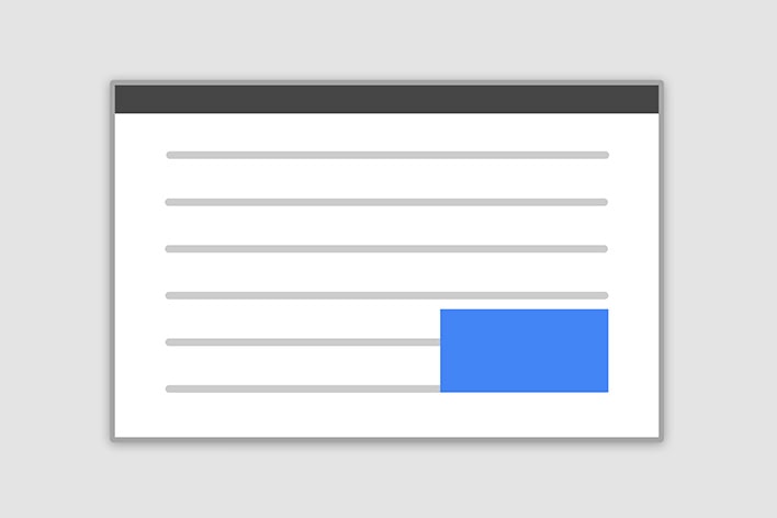
Position
Central modal

Size

How it works
Before getting started with MDB modal component, be sure to read the following as our menu options have recently changed.
-
Modals are positioned over everything else in the document and remove scroll from the
<body>so that modal content scrolls instead. - Clicking on the modal “backdrop” will automatically close the modal.
- Bootstrap only supports one modal window at a time. Nested modals aren’t supported as we believe them to be poor user experiences.
-
Modals use
position: fixed, which can sometimes be a bit particular about its rendering. Whenever possible, place your modal HTML in a top-level position to avoid potential interference from other elements. You’ll likely run into issues when nesting aMDBModalwithin another fixed element. -
Once again, due to
position: fixed, there are some caveats with using modals on mobile devices. -
Due to how HTML5 defines its semantics,
the
autofocusHTML attribute has no effect in Bootstrap modals. To achieve the same effect, use some custom JavaScript:
          <template>
            <MDBModal v-on:shown="setFocus" v-model="show">
              <MDBModalBody>
                <MDBInput id="myInput" />
              </MDBModalBody>
            </MDBModal>
            <MDBBtn @click="show = true">Open modal</MDBBtn>
          </template>
          <script>
            import { MDBModal, MDBModalBody, MDBInput, MDBBtn } from 'mdb-vue-ui-kit';

            export default {
              components: {
                MDBModal,
                MDBModalBody,
                MDBInput,
                MDBBtn,
              },
              setup() {
                function setFocus() {
                  const myInput = document.getElementById('myInput');
                  myInput.focus();
                }

                const show = ref(false);

                return {
                  setFocus,
                  show,
                };
              },
            };
          </script>
Modal components
Below is a static MDBModal example (meaning its
position and display have been overridden). Included are the
MDBModalHeader, MDBModalBody (required for padding),
and MDBModalFooter (optional). MDBModalHeader is by default included
with dismiss action button. You can also provide another explicit dismiss action, e.g. inside
MDBModalFooter component.
          <template>
            <MDBModal
              tabindex="-1"
              style="position: static; display: block; height: auto"
              :modelValue="true"
              removeBackdrop
            >
              <MDBModalHeader>
                <MDBModalTitle>Modal title</MDBModalTitle>
              </MDBModalHeader>
              <MDBModalBody>
                <p>Modal body text goes here.</p>
              </MDBModalBody>
              <MDBModalFooter>
                <MDBBtn color="secondary"> Close </MDBBtn>
                <MDBBtn color="primary"> Save changes </MDBBtn>
              </MDBModalFooter>
            </MDBModal>
          </template>
          <script>
            import {
              MDBModal,
              MDBModalHeader,
              MDBModalTitle,
              MDBModalBody,
              MDBModalFooter,
              MDBBtn,
            } from 'mdb-vue-ui-kit';

            export default {
              components: {
                MDBModal,
                MDBModalHeader,
                MDBModalTitle,
                MDBModalBody,
                MDBModalFooter,
                MDBBtn,
              },
            };
          </script>
Static backdrop
When staticBackdrop property is added to MDBModal, the modal will
not close when clicking outside it. Click the button below to try it.
          <template>
            <!-- Button trigger modal -->
            <MDBBtn
              color="primary"
              aria-controls="staticBackdropLabel"
              @click="staticBackdrop = true"
            >
              Launch static backdrop modal
            </MDBBtn>

            <!-- Modal -->
            <MDBModal
              id="staticBackdrop"
              tabindex="-1"
              labelledby="staticBackdropLabel"
              v-model="staticBackdrop"
              staticBackdrop
            >
              <MDBModalHeader>
                <MDBModalTitle id="staticBackdropLabel"> Modal title </MDBModalTitle>
              </MDBModalHeader>
              <MDBModalBody>...</MDBModalBody>
              <MDBModalFooter>
                <MDBBtn color="secondary" @click="staticBackdrop = false"> Close </MDBBtn>
                <MDBBtn color="primary"> Understood </MDBBtn>
              </MDBModalFooter>
            </MDBModal>
          </template>
          <script>
            import {
              MDBModal,
              MDBModalHeader,
              MDBModalTitle,
              MDBModalBody,
              MDBModalFooter,
              MDBBtn,
            } from 'mdb-vue-ui-kit';
            import { ref } from 'vue';

            export default {
              components: {
                MDBModal,
                MDBModalHeader,
                MDBModalTitle,
                MDBModalBody,
                MDBModalFooter,
                MDBBtn,
              },
              setup() {
                const staticBackdrop = ref(false);

                return {
                  staticBackdrop,
                };
              },
            };
          </script>
Scrolling long content
When modals become too long for the user’s viewport or device, they scroll independent of the page itself. Try the demo below to see what we mean.
You can also create a scrollable modal that allows scroll the modal body by adding
scrollable property to MDBModal.
          <template>
            <MDBBtn
              color="primary"
              aria-controls="exampleModalLongTitle"
              @click="exampleModalLong = true"
            >
              Launch demo modal
            </MDBBtn>

            <MDBModal
              class="modal fade"
              id="exampleModalLong"
              tabindex="-1"
              labelledby="exampleModalLongTitle"
              v-model="exampleModalLong"
            >
              <MDBModalHeader>
                <MDBModalTitle id="exampleModalLongTitle"> Modal title </MDBModalTitle>
              </MDBModalHeader>
              <MDBModalBody> ... long body </MDBModalBody>
              <MDBModalFooter>
                <MDBBtn color="secondary" @click="exampleModalLong = false"> Close </MDBBtn>
                <MDBBtn color="primary"> Save changes </MDBBtn>
              </MDBModalFooter>
            </MDBModal>

            <MDBBtn
              color="primary"
              aria-controls="exampleModalScrollableTitle"
              @click="exampleModalScrollable = true"
            >
              Launch demo modal
            </MDBBtn>

            <MDBModal
              id="exampleModalScrollable"
              tabindex="-1"
              labelledby="exampleModalScrollableTitle"
              v-model="exampleModalScrollable"
              scrollable
            >
              <MDBModalHeader>
                <MDBModalTitle id="exampleModalScrollableTitle"> Modal title </MDBModalTitle>
              </MDBModalHeader>
              <MDBModalBody> ... long content </MDBModalBody>
              <MDBModalFooter>
                <MDBBtn color="secondary" @click="exampleModalScrollable = false"> Close </MDBBtn>
                <MDBBtn color="primary"> Save changes </MDBBtn>
              </MDBModalFooter>
            </MDBModal>
          </template>
          <script>
            import {
              MDBModal,
              MDBModalHeader,
              MDBModalTitle,
              MDBModalBody,
              MDBModalFooter,
              MDBBtn,
            } from 'mdb-vue-ui-kit';
            import { ref } from 'vue';

            export default {
              components: {
                MDBModal,
                MDBModalHeader,
                MDBModalTitle,
                MDBModalBody,
                MDBModalFooter,
                MDBBtn,
              },
              setup() {
                const exampleModalLong = ref(false);
                const exampleModalScrollable = ref(false);

                return {
                  exampleModalScrollable,
                  exampleModalLong,
                };
              },
            };
          </script>
Vertically centered
Add centered to MDBModal to vertically center the modal.
          <template>
            <MDBBtn
              color="primary"
              aria-controls="exampleModalCenter"
              @click="exampleModalCenter = true"
            >
              Vertically centered modal
            </MDBBtn>

            <MDBModal
              id="exampleModalCenter"
              tabindex="-1"
              labelledby="exampleModalCenterTitle"
              v-model="exampleModalCenter"
              centered
            >
              <MDBModalHeader>
                <MDBModalTitle id="exampleModalCenterTitle"> Modal title </MDBModalTitle>
              </MDBModalHeader>
              <MDBModalBody>
                <p>
                  Cras mattis consectetur purus sit amet fermentum. Cras justo odio, dapibus ac
                  facilisis in, egestas eget quam. Morbi leo risus, porta ac consectetur ac,
                  vestibulum at eros.
                </p>
              </MDBModalBody>
              <MDBModalFooter>
                <MDBBtn color="secondary" @click="exampleModalCenter = false"> Close </MDBBtn>
                <MDBBtn color="primary"> Save changes </MDBBtn>
              </MDBModalFooter>
            </MDBModal>

            <MDBBtn
              color="primary"
              aria-controls="exampleModalCenteredScrollable"
              @click="exampleModalCenteredScrollable = true"
            >
              Vertically centered scrollable modal
            </MDBBtn>

            <MDBModal
              id="exampleModalCenteredScrollable"
              tabindex="-1"
              labelledby="exampleModalCenteredScrollableTitle"
              v-model="exampleModalCenteredScrollable"
              centered
              scrollable
            >
              <MDBModalHeader>
                <MDBModalTitle id="exampleModalCenteredScrollableTitle">
                  Modal title
                </MDBModalTitle>
              </MDBModalHeader>
              <MDBModalBody> ... long content </MDBModalBody>
              <MDBModalFooter>
                <MDBBtn color="secondary" @click="exampleModalCenteredScrollable = false">
                  Close
                </MDBBtn>
                <MDBBtn color="primary"> Save changes </MDBBtn>
              </MDBModalFooter>
            </MDBModal>
          </template>
          <script>
            import {
              MDBModal,
              MDBModalHeader,
              MDBModalTitle,
              MDBModalBody,
              MDBModalFooter,
              MDBBtn,
            } from 'mdb-vue-ui-kit';
            import { ref } from 'vue';

            export default {
              components: {
                MDBModal,
                MDBModalHeader,
                MDBModalTitle,
                MDBModalBody,
                MDBModalFooter,
                MDBBtn,
              },
              setup() {
                const exampleModalCenteredScrollable = ref(false);

                return {
                  exampleModalCenteredScrollable,
                };
              },
            };
          </script>
Tooltips and popovers
Tooltips and
popovers can be placed within modals as
needed. You can add function on hide event to manually close any opened popover
or tooltip when closing modal.
          <template>
            <MDBBtn
              color="primary"
              aria-controls="exampleModalPopovers"
              @click="exampleModalPopovers = true"
            >
              Launch demo modal
            </MDBBtn>

            <MDBModal
              id="exampleModalPopovers"
              tabindex="-1"
              labelledby="exampleModalPopoversLabel"
              v-model="exampleModalPopovers"
              @hide="
                () => {
                  popover1 = false;
                  tooltip1 = false;
                }
              "
            >
              <MDBModalHeader>
                <MDBModalTitle id="exampleModalPopoversLabel"> Modal title </MDBModalTitle>
              </MDBModalHeader>
              <MDBModalBody>
                <h5>Popover in a modal</h5>
                <p>
                  This
                  <MDBPopover v-model="popover1" direction="right">
                    <template #reference>
                      <MDBBtn color="secondary" size="lg" @click="popover1 = !popover1"
                        >button</MDBBtn
                      >
                    </template>
                    <template #header>Popover title</template>
                    <template #body>Popover body content is set in this attribute.</template>
                  </MDBPopover>
                  triggers a popover on click.
                </p>
                <hr />
                <h5>Tooltips in a modal</h5>
                <p>
                  <MDBTooltip v-model="tooltip1">
                    <template #reference><a href="#">This link</a></template>
                    <template #tip> Tooltip </template>
                  </MDBTooltip>
                  and
                  <MDBTooltip v-model="tooltip2">
                    <template #reference><a href="#">that link</a></template>
                    <template #tip> Tooltip </template>
                  </MDBTooltip>
                  have tooltips on hover.
                </p></MDBModalBody
              >

              <MDBModalFooter>
                <MDBBtn color="secondary" @click="exampleModalPopovers = false"> Close </MDBBtn>
                <MDBBtn color="primary"> Save changes </MDBBtn>
              </MDBModalFooter>
            </MDBModal>
          </template>
          <script>
            import {
              MDBModal,
              MDBModalHeader,
              MDBModalTitle,
              MDBModalBody,
              MDBModalFooter,
              MDBBtn,
              MDBPopover,
              MDBTooltip,
            } from 'mdb-vue-ui-kit';
            import { ref } from 'vue';

            export default {
              components: {
                MDBModal,
                MDBModalHeader,
                MDBModalTitle,
                MDBModalBody,
                MDBModalFooter,
                MDBBtn,
                MDBPopover,
                MDBTooltip,
              },
              setup() {
                const exampleModalPopovers = ref(false);
                const popover1 = ref(false);
                const tooltip1 = ref(false);
                const tooltip2 = ref(false);

                return {
                  exampleModalPopovers,
                  popover1,
                  tooltip1,
                  tooltip2,
                };
              },
            };
          </script>
Using the grid
Utilize the Bootstrap grid system within a modal by nesting
MDBContainer fluid within the MDBModalBody. Then, use the normal
grid system properties/classes as you would anywhere else.
          <template>
            <MDBBtn color="primary" aria-controls="gridSystemModal" @click="gridSystemModal = true">
              Launch demo modal
            </MDBBtn>

            <MDBModal
              id="gridSystemModal"
              tabindex="-1"
              labelledby="gridModalLabel"
              v-model="gridSystemModal"
            >
              <MDBModalHeader>
                <MDBModalTitle id="gridModalLabel"> Grids in modals </MDBModalTitle>
              </MDBModalHeader>
              <MDBModalBody>
                <MDBContainer fluid class="bd-example-row">
                  <MDBRow>
                    <MDBCol md="4" class="col-example">md="4"</MDBCol>
                    <MDBCol md="4" class="ms-auto col-example"> md="4" .ms-auto </MDBCol>
                  </MDBRow>
                  <MDBRow>
                    <MDBCol md="3" class="ms-auto col-example"> md="3" .ms-auto </MDBCol>
                    <MDBCol md="2" class="ms-auto col-example"> md="2" .ms-auto </MDBCol>
                  </MDBRow>
                  <MDBRow>
                    <MDBCol md="6" class="ms-auto col-example"> md="6" .ms-auto </MDBCol>
                  </MDBRow>
                  <MDBRow>
                    <MDBCol sm="9" class="col-example">
                      Level 1: sm="9"
                      <MDBRow>
                        <MDBCol col="8" sm="6" class="col-example">
                          Level 2: col="8" sm="6"
                        </MDBCol>
                        <MDBCol col="4" sm="6" class="col-example">
                          Level 2: col="4" sm="6"
                        </MDBCol>
                      </MDBRow>
                    </MDBCol>
                  </MDBRow>
                </MDBContainer>
              </MDBModalBody>
              <MDBModalFooter>
                <MDBBtn color="secondary" @click="gridSystemModal = false"> Close </MDBBtn>
                <MDBBtn color="primary"> Save changes </MDBBtn>
              </MDBModalFooter>
            </MDBModal>
          </template>
          <script>
            import {
              MDBModal,
              MDBModalHeader,
              MDBModalTitle,
              MDBModalBody,
              MDBModalFooter,
              MDBBtn,
            } from 'mdb-vue-ui-kit';
            import { ref } from 'vue';

            export default {
              components: {
                MDBModal,
                MDBModalHeader,
                MDBModalTitle,
                MDBModalBody,
                MDBModalFooter,
                MDBBtn,
              },
              setup() {
                const gridSystemModal = ref(false);

                return {
                  gridSystemModal,
                };
              },
            };
          </script>
Varying modal content
Have a bunch of buttons that all trigger the same modal with slightly different contents? Use
Vue
refs
to vary the contents of the modal depending on which button was clicked.
Below is a live demo followed by example Vue template and script.
          <template>
            <MDBBtn
              color="primary"
              aria-controls="varyingExampleModal"
              @click="
                () => {
                  modalContent = '@mdo';
                  varyingExampleModal = true;
                }
              "
            >
              Open modal for @mdo
            </MDBBtn>
            <MDBBtn
              color="primary"
              aria-controls="varyingExampleModal"
              @click="
                () => {
                  modalContent = '@fat';
                  varyingExampleModal = true;
                }
              "
            >
              Open modal for @fat
            </MDBBtn>
            <MDBBtn
              color="primary"
              aria-controls="varyingExampleModal"
              @click="
                () => {
                  modalContent = '@getbootstrap';
                  varyingExampleModal = true;
                }
              "
            >
              Open modal for @getbootstrap
            </MDBBtn>

            <MDBModal
              id="varyingExampleModal"
              tabindex="-1"
              labelledby="varyingExampleModalLabel"
              v-model="varyingExampleModal"
            >
              <MDBModalHeader>
                <MDBModalTitle id="varyingExampleModalLabel"> New message </MDBModalTitle>
              </MDBModalHeader>
              <MDBModalBody>
                <form>
                  <div class="mb-3">
                    <label for="recipient-name" class="col-form-label">Recipient: </label>
                    <input
                      type="text"
                      class="form-control"
                      id="recipient-name"
                      :value="modalContent"
                    />
                  </div>
                  <div class="mb-3">
                    <label for="message-text" class="col-form-label">Message:</label>
                    <textarea class="form-control" id="message-text"></textarea>
                  </div>
                </form>
              </MDBModalBody>
              <MDBModalFooter>
                <MDBBtn color="secondary" @click="varyingExampleModal = false"> Close </MDBBtn>
                <MDBBtn color="primary"> Send message </MDBBtn>
              </MDBModalFooter>
            </MDBModal>
          </template>
          <script>
            import { MDBModal, MDBModalHeader, MDBModalTitle, MDBModalBody, MDBModalFooter, MDBBtn } from "mdb-vue-ui-kit";
            import { ref } from 'vue';

            export default {
              components: {
                MDBModal,
                MDBModalHeader,
                MDBModalTitle,
                MDBModalBody,
                MDBModalFooter,
                MDBBtn
              },
              setup() {
                const varyingExampleModal = ref(false);
                const modalContent = ref('');

                return {
                  varyingExampleModal,
                  modalContent,
                }
              }
            };
          </script>
Change animation
The $modal-fade-transform variable determines the transform state of
modal dialog content before the modal fade-in animation, the
$modal-show-transform variable determines the transform of
.modal-dialog at the end of the modal fade-in animation.
If you want for example a zoom-in animation, you can set
$modal-fade-transform: scale(.8).
Remove animation
For modals that simply appear rather than fade in to view, add the
:animation="false" property to your modal markup.
          <template>
            <MDBModal tabindex="-1" labelledby="..." v-model="..." :animation="false" />
          </template>
Dynamic heights
If the height of a modal changes while it is open, you should call
myModal.handleUpdate() to readjust the modal’s position in case a scrollbar
appears.
Accessibility
Be sure to add labelledby="...", referencing the modal title, to
MDBMOdal. Additionally, you may give a description of your modal dialog with
aria-describedby on MDBModal. Note that you don’t need to add
role="dialog" since we already add it inside component.
Embedding YouTube videos
Embedding YouTube videos in modals requires additional JavaScript not in Bootstrap to automatically stop playback and more. See this helpful Stack Overflow post for more information.
Optional sizes
Modals have three optional sizes, available via modifier properties to be placed on a
MDBModal. These sizes kick in at certain breakpoints to avoid horizontal
scrollbars on narrower viewports.
| Size | Property | Modal max-width |
|---|---|---|
| Small | size="sm" |
300px |
| Default | None | 500px |
| Large | size="lg" |
800px |
| Extra large | size="xl" |
1140px |
          <template>
            <MDBModal size="xl">...</MDBModal>
            <MDBModal size="lg">...</MDBModal>
            <MDBModal size="sm">...</MDBModal>
          </template>
Fullscreen Modal
Another override is the option to pop up a modal that covers the user viewport, available via
fullscreen properties that are placed on a MDBModal.
| Class | Availability |
|---|---|
fullscreen |
Always |
fullscreen="sm-down" |
Below 576px |
fullscreen="md-down" |
Below 768px |
fullscreen="lg-down" |
Below 992px |
fullscreen="xl-down" |
Below 1200px |
fullscreen="xxl-down" |
Below 1400px |
          <!-- Full screen modal -->
          <template>
            <MDBModal fullscreen>...</MDBModal>
            <MDBModal fullscreen="sm-down">...</MDBModal>
            <MDBModal fullscreen="md-down">...</MDBModal>
            <MDBModal fullscreen="lg-down">...</MDBModal>
            <MDBModal fullscreen="xl-down">...</MDBModal>
            <MDBModal fullscreen="xxl-down">...</MDBModal>
          </template>
Modal - API
Import
        <script>
          import {
            MDBModal,
            MDBModalBody,
            MDBModalHeader,
            MDBModalTitle,
            MDBModalFooter
          } from 'mdb-vue-ui-kit';
        </script>
Properties
Modal
| Name | Type | Default | Description | Example |
|---|---|---|---|---|
tag
|
String | 'div' |
Defines tag of the MDBModal element |
<MDBModal tag="span" />
|
v-model
|
String | false |
Opens / closes modal component |
<MDBModal v-model="true" />
|
size
|
String | -- |
Sets size of MDBModal component. Use "sm | lg | xl" values |
<MDBModal size="sm" /> |
centered
|
Boolean | false |
Center modal vertically and horizonally |
<MDBModal centered />
|
staticBackdrop
|
Boolean | false |
Will prevent modal close when clicking outside the backdrop |
<MDBModal staticBackdrop />
|
removeBackdrop
|
Boolean | false |
Removes the dark overlay from the background, along its functionality |
<MDBModal removeBackdrop />
|
bgSrc
|
String | -- |
Dark style necessitate having a picture background, but the feature is for all the modals, really |
<MDBModal bgSrc="/image/src" />
|
scrollable
|
Boolean | false |
Allows to scroll through long contents with a scrollbar |
<MDBModal scrollable />
|
animation
|
Boolean | true |
Turn modal animation on or off |
<MDBModal :animation="false" />
|
duration
|
Number | 400 |
Sets animation duration in miliseconds |
<MDBModal :duration="500" />
|
fullscreen
|
Number | 400 |
Makes the modal cover user viewport on a specific breakpoint |
<MDBModal :fullscreen="lg-down" />
|
labelledby
|
String | -- |
When having modal content with the title add labelledby to make modal
more accessible
|
<MDBModal labelledby="modalExampleTitle">
<MDBModalHeader>
<MDBModalTitle tag="h4" id="modalExampleTitle">
Modal title
</MDBModalTitle>
</MDBModalHeader>
</MDBModal>
|
Modal Header
| Name | Type | Default | Description | Example |
|---|---|---|---|---|
tag
|
String | 'div' |
Defines tag of the MDBModalHeader element |
<MDBModalHeader tag="header" />
|
close
|
Boolean | true |
Turning it to false removes the close "x" icon in the right top corner |
<MDBModalHeader :close="false" />
|
closeWhite
|
Boolean | false |
Makes the closing "x" sign works better with dark variant of the modal |
<MDBModalHeader :closeWhite />
|
color
|
String | -- |
Determines color of the header |
<MDBModalHeader color="secondary" />
|
Modal Title
| Name | Type | Default | Description | Example |
|---|---|---|---|---|
tag
|
String | 'h5' |
Defines tag of the MDBModalTitle element |
<MDBModalTitle tag="h6" />
|
bold
|
Boolean | false |
Makes title font bold |
<MDBModalTitle bold />
|