Topic: Side Nav Hamburger Menu displaying on large screens

Expected behavior The hamburger menu should not be displaying on large screens and should only appear on mobile
Actual behavior
Is displaying on large screens. Everything is working fine with the exception that the bar should be hidden on larger sizes. Anyone have a fix for this? Its literally a new react project and I copy pasted the code from SideNav component**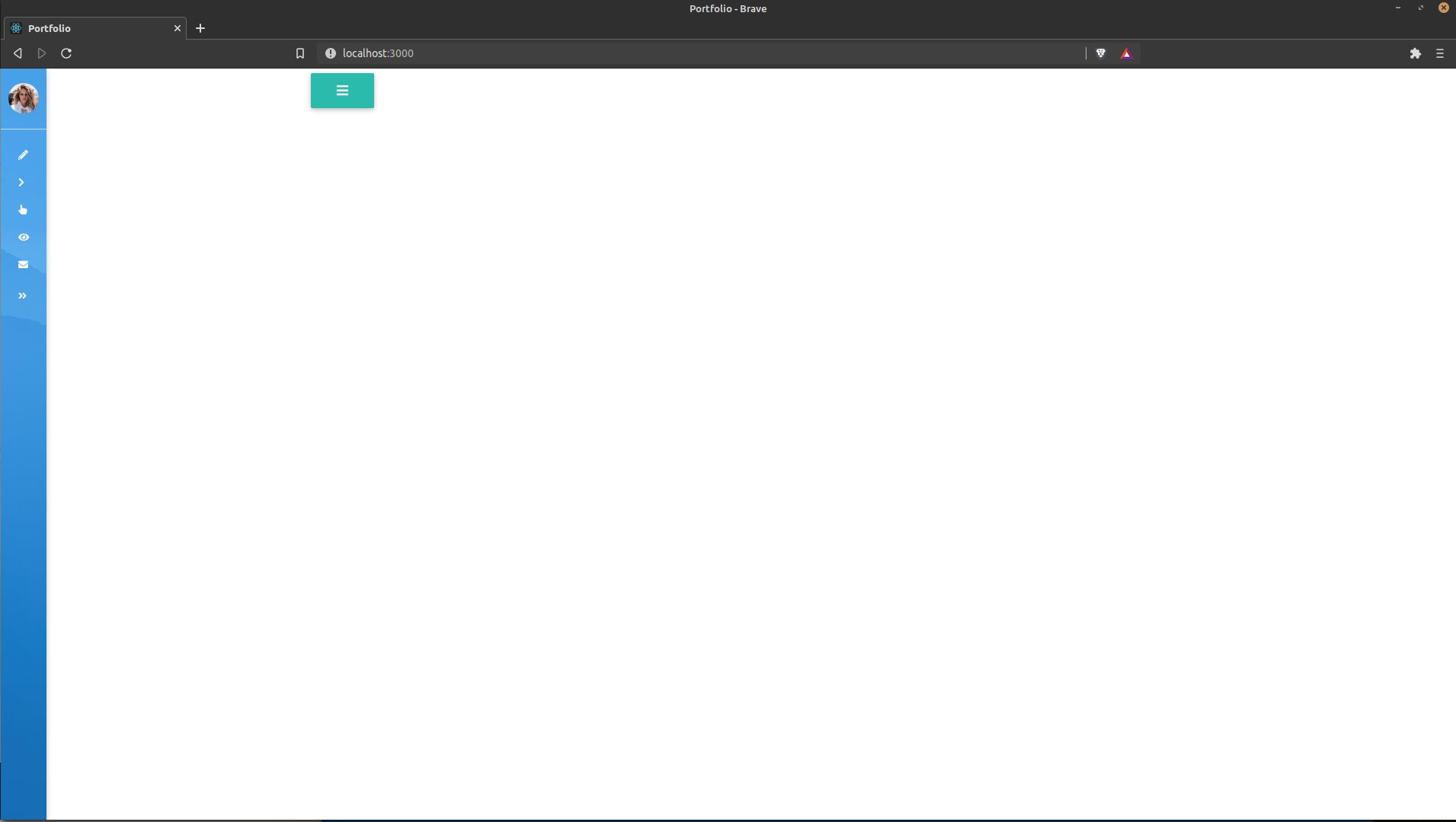
Status
Open
Specification of the issue
- User: Pro
- Premium support: Yes
- Technology: React
- MDB Version: 5.0.1
- Device: Desktop
- Browser: Chrome
- OS: Linux
- Provided sample code: No
- Provided link: No
Related topics
Piotr Glejzer staff commented 3 months ago
you can use the display to hide the hamburger button on larger screens https://mdbootstrap.com/docs/react/utilities/display/