Topic: Strange space between components on mobile browser

Expected behavior All my components vertically align with no huge spaces or gaps in content Actual behavior it works fine on computer but when i test the site on a mobile browser there is a large vertical space between the CTA Bar (button group below opening carousel below "contact") and the next element which is an accordion. Resources (screenshots, code snippets etc.)
PC:
Mobile: 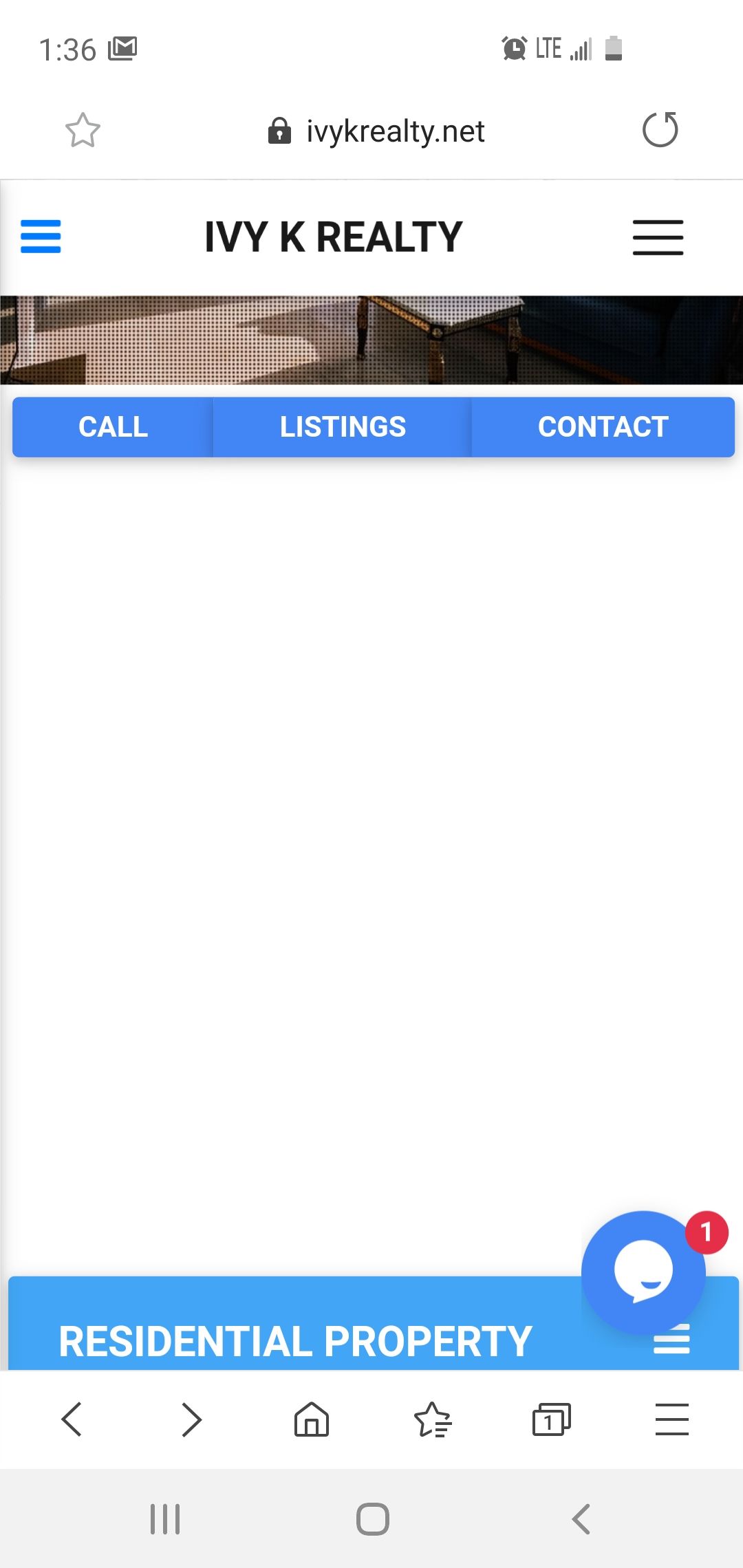

Hi,
I've checked your page on web developer tools and on iPhone 6s and I don't see the problem you've mentioned above, look at my screenshot below.
.jpg) If you still need help, please provide more details, like a version of the system of your phone and other details that could help reproduce the problem.
If you still need help, please provide more details, like a version of the system of your phone and other details that could help reproduce the problem.
Best, Marta
Answered
- User: Pro
- Premium support: Yes
- Technology: jQuery
- MDB Version: 4.16.0
- Device: mobile
- Browser: chrome / samsung
- OS: android
- Provided sample code: No
- Provided link: No