Topic: Cards height in Iphone

Hi,
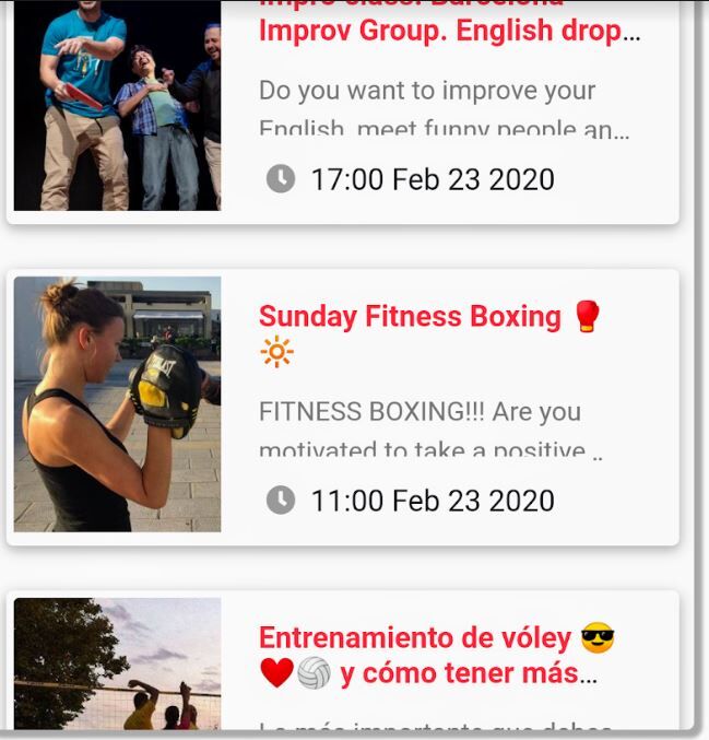
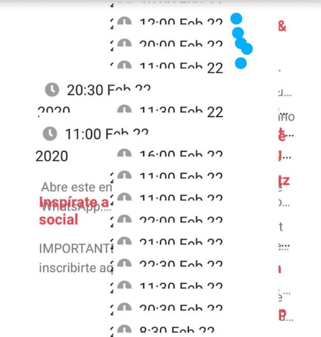
I have a list with cards and it works well in Chrome as well in Mac laptops with Safari. However, when the web is open in Iphone devices, the cards list is not shown as expected, see figures below. How can be solved this issue with Iphone devices?
Here a sample code of a card:
  <div class="card mb-4 mr-2 ml-2">
            <div class="card-horizontal pt-1 mb-1 ml-1">
            <!--Card image-->
            <div class="view overlay">
                          <img class="card-img-top" src="{% xx %}" alt="Card image cap">
                      <a href="{% xx %}" target="_blank">
                        <div class="mask rgba-white-slight"></div>
                      </a>
            </div>

            <!--Card content-->
            <div class="card-body mt-n2">

              <!--Title-->
              <h6 class="card-title"><a class="text-danger" style="font-weight:bold">xx</a></h6>
              <!--Text-->
              <p class="card-text">xx</p>
                    <a href="{% xx %}" class="stretched-link" onmouseover="activeMarker({{ forloop.counter }})" onmouseout="normalMarker({{ forloop.counter }})" target="_blank"></a>
               <div class="card-footer">
                <span class="float-left ml-n4">
                  <a class="ml-n2 mr-1" data-toggle="tooltip" data-placement="top" title="Quick Look">
                    <i class="fas fa-clock grey-text ml-3"></i>
                  </a>
                        {{ xx }}
                </span>
               </div>
            </div>

              </div>

          </div>
Expected behavior
Actual behavior
Resources (screenshots, code snippets etc.)

Hi,
would you create a snippet showing the problem here: https://mdbootstrap.com/snippets/? I'll try to help you.
Best, Marta
alexq pro premium commented a year ago
Hi Marta,
Here you can find the snippet: https://mdbootstrap.com/snippets/jquery/alexq/1798251
Regards, Alex
Marta Szymanska staff pro premium commented a year ago
Hi,
it is happening because you use viewport height units for your cards. Why you need them instead of using a responsive grid?
Best, Marta
alexq pro premium commented a year ago
If I use responsive grid some cards size change. Images don't have the same size. I had issues trying to have the same card size when the text or the image have different size.
REgards, Alex
Marta Szymanska staff pro premium commented a year ago
Hi,
I change some parts in your code, but I'm not sure if it is an effect you wanted to achieve: https://mdbootstrap.com/snippets/jquery/alexq/1798251#html-tab-view. If it's not, please explain your idea in more detail to allow me to help you.
Best, Marta
alexq pro premium commented a year ago
Hi Marta,
If you add in the first card this image (https://mdbootstrap.com/img/Photos/Others/product1.jpg) you will see how it is expanded and does not keep the same width in the card as when you use image (https://mdbootstrap.com/img/Photos/Others/images/43.jpg).
Regards, Alex
Marta Szymanska staff pro premium commented a year ago
Hi,
if you want to have the same width of images in cards, maybe this solution will be good for you: https://mdbootstrap.com/snippets/jquery/marta-szymanska/1828136.
Best, Marta
alexq pro premium commented a year ago
Thank you Marta, it works as expected.
Regards, Alex
Resolved
- User: Pro
- Premium support: Yes
- Technology: jQuery
- MDB Version: 4.8.8
- Device: Iphone
- Browser: Safari
- OS: ios
- Provided sample code: No
- Provided link: No