Topic: side navigation covers main content

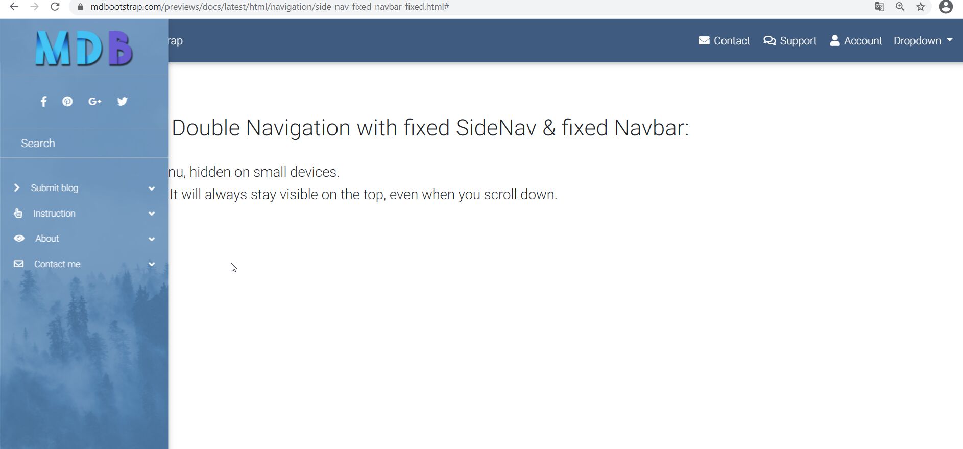
Expected behavior Normally the sidenav should be hidden on small devices.
Actual behavior here in the following screenshot the menu covers the main content. i have the same problem which is show in the mdb-example
Resources (screenshots, code snippets etc.)
Status
Resolved
Specification of the issue
- User: Pro
- Premium support: No
- Technology: General Bootstrap questions
- MDB Version: -
- Device: PC
- Browser: IE, Chrome, FireFox
- OS: Win10, Win7
- Provided sample code: No
- Provided link: No
Tags
Related topics
Marcin Luczak staff commented 2 months ago
Hi @fss,
I've found that this happens when you have opened Sidenav on smaller width of the screen and try to resize it to a bigger size with changing browser width. Is that your case? When I resize the window by changing the device it seems to be working fine. I've added this task to our issue list and we will try to work on that for future release.
Regards, Marcin
fss pro commented 2 months ago
Hi Marcin, in much cases it happens on apple mac with safari. on a certain resolution. i tryed to work with: .navbar { z-index: 1040; }
but it doesn't solve this issue.
Marcin Luczak staff commented 1 months ago
You can try to explicitly add padding for the navbar on specific media query, please see CSS section inside my snippet: https://mdbootstrap.com/snippets/jquery/marcin-luczak/2877962
Regards, Marcin
fss pro commented 2 weeks ago
your snippet worx. thx a lot
Marcin Luczak staff commented 2 weeks ago
I'm glad that it works :)
Regards, Marcin