
Angular Bootstrap Masonry
Angular Masonry - Bootstrap 4 & Material Design
Angular Bootstrap masonry is a grid layout based on columns. Unlike other grid layouts, it doesn’t have fixed height rows. Basically, Masonry layout optimizes the use of space inside the web page by reducing any unnecessary gaps. Without this type of layout, certain restrictions are required to maintain the structure of layout.
Basic layout
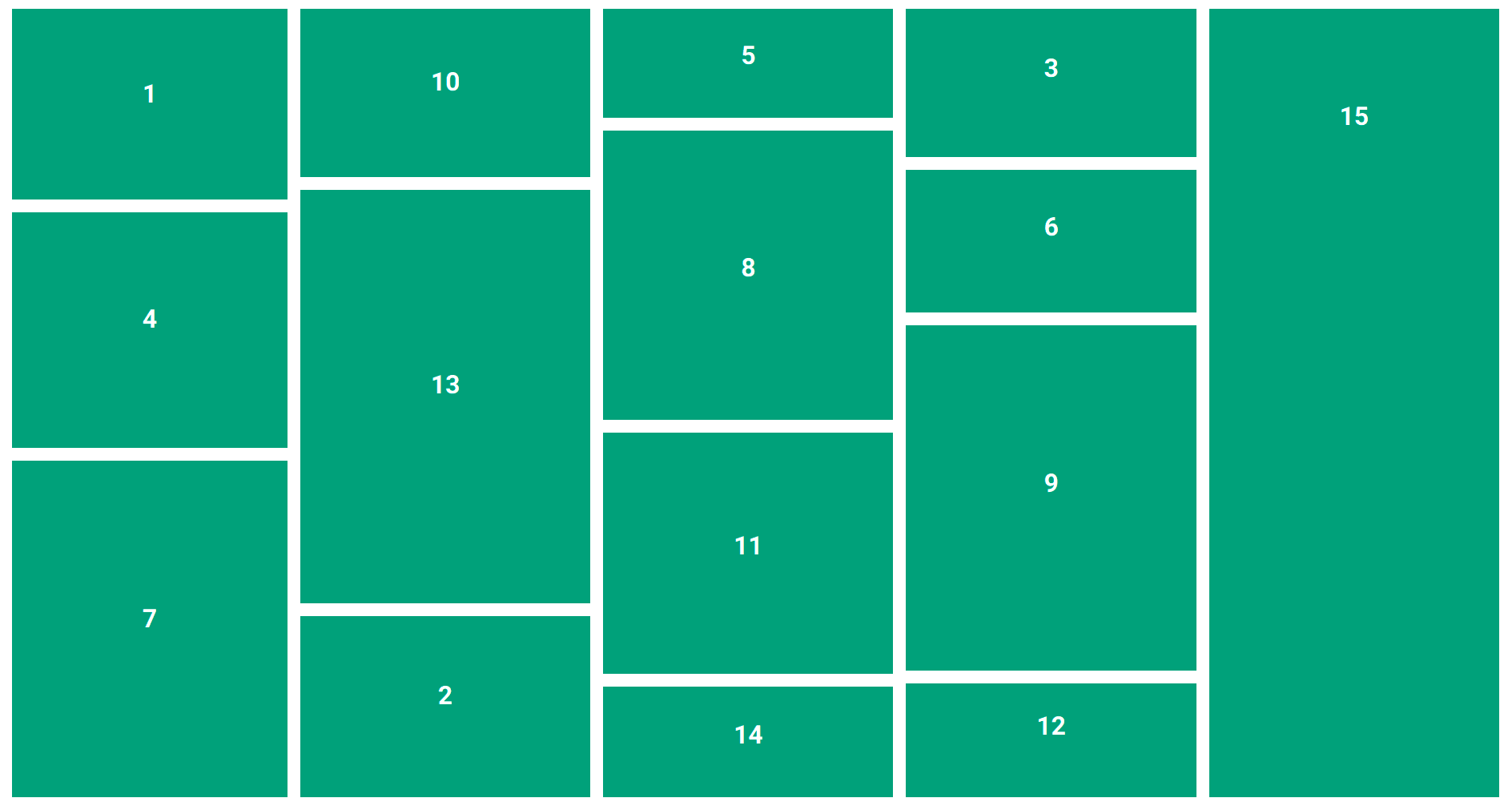
        <div class="masonry-with-columns" #masonry>
          <div style="order: 0;">
            1
          </div>
          <div style="order: 1;">
            2
          </div>
          <div style="order: 2;">
            3
          </div>
          <div style="order: 0;">
            4
          </div>
          <div style="order: 1;">
            5
          </div>
          <div style="order: 2;">
            6
          </div>
          <div style="order: 0;">
            7
          </div>
          <div style="order: 1;">
            8
          </div>
          <div style="order: 2;">
            9
          </div>
          <div style="order: 0;">
            10
          </div>
          <div style="order: 1;">
            11
          </div>
          <div style="order: 2;">
            12
          </div>
          <div style="order: 0;">
            13
          </div>
          <div style="order: 1;">
            14
          </div>
          <div style="order: 2;">
            15
          </div>
        </div>
          // Within style tags in your html file
          body {
            margin: 0;
            padding: 1rem;
          }
          // SCSS
          // Masonry layout vertical
          .masonry-with-columns {
            display: flex;
            flex-direction: column;
            flex-wrap: wrap;
            max-height: 1000px;
            div {
              flex: 1 0 auto;
              background: #00997B;
              color: white;
              margin: 0 1rem 1rem 0;
              text-align: center;
              font-weight: 900;
              font-size: 2rem;
            }
            @for $i from 1 through 36 {
              div:nth-child(#{$i}) {
                $h: (random(400) + 100) + px;
                height: $h;
                line-height: $h;
              }
            }
          }
        import {AfterViewInit, Component, ElementRef, Renderer2, ViewChild} from '@angular/core';

        @Component({
          selector: 'masonry',
          templateUrl: './masonry.component.html',
          styleUrls: ['./masonry.component.scss']
        })
        export class MasonryComponent implements AfterViewInit {
          @ViewChild('masonry', { static: true }) masonry: ElementRef;

          constructor(private renderer: Renderer2) { }

          ngAfterViewInit() {
            const numCols = 3;
            const colHeights = Array(numCols).fill(0);
            Array.from(this.masonry.nativeElement.children).forEach((child: any, i) => {
              const order = i % numCols;
              this.renderer.setStyle(child, 'order', order);
              colHeights[order] += parseFloat(child.clientHeight);
            })
            this.renderer.setStyle(this.masonry.nativeElement, 'height', `${Math.max(...colHeights)}px`)
          }
        }
Horizontal option

        <div class="masonry-with-columns-2">
          <div>
            1
          </div>
          <div>
            2
          </div>
          <div>
            3
          </div>
          <div>
            4
          </div>
          <div>
            5
          </div>
          <div>
            6
          </div>
          <div>
            7
          </div>
          <div>
            8
          </div>
          <div>
            9
          </div>
          <div>
            10
          </div>
          <div>
            11
          </div>
          <div>
            12
          </div>
          <div>
            13
          </div>
          <div>
            14
          </div>
          <div>
            15
          </div>
        </div>
          // Within style tags in your html file
          body {
            margin: 0;
            padding: 1rem;
          }
          // SCSS
          // Masonry layout horizontal
          .masonry-with-columns-2 {
            display: flex;
            flex-wrap: wrap;
            div {
              height: 150px;
              line-height: 150px;
              background: #9B1B30;
              color: white;
              margin: 0 1rem 1rem 0;
              text-align: center;
              font-weight: 900;
              font-size: 2rem;
              flex: 1 0 auto;
            }
            @for $i from 1 through 36 {
              div:nth-child(#{$i}) {
                $h: (random(400) + 70) + px;
                width: $h;
              }
            }
          }
Flexbox option
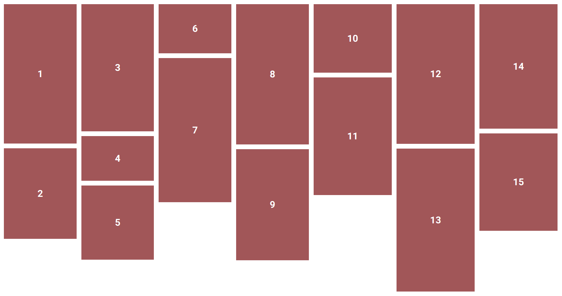
          <div class="masonry-with-flex">
            <div>
              1
            </div>
            <div>
              2
            </div>
            <div>
              3
            </div>
            <div>
              4
            </div>
            <div>
              5
            </div>
            <div>
              6
            </div>
            <div>
              7
            </div>
            <div>
              8
            </div>
            <div>
              9
            </div>
            <div>
              10
            </div>
            <div>
              11
            </div>
            <div>
              12
            </div>
            <div>
              13
            </div>
            <div>
              14
            </div>
            <div>
              15
            </div>
          </div>
          // Within style tags in your html file
          body {
            margin: 0;
            padding: 1rem;
          }
          // SCSS
          // Masonry layout flex
          .masonry-with-flex {
            display: flex;
            flex-direction: column;
            flex-wrap: wrap;
            max-height: 1000px;
            div {
              width: auto;
              background: #975A58;
              color: white;
              margin: 0 1rem 1rem 0;
              text-align: center;
              font-weight: 900;
              font-size: 2rem;
            }
            @for $i from 1 through 36 {
              div:nth-child(#{$i}) {
                $h: (random(400) + 100) + px;
                height: $h;
                line-height: $h;
              }
            }
          }